Powered by Blogger.

angelo : home

Tuesday, May 31, 2011

                                    angelo:HOME Sutton Loveseat Black and White Vine

                             just price :  angelo:HOME Sutton Loveseat Black and White Vine  


                                      angelo:HOME Grant Chair Black and White Damask


                            just price : angelo:HOME Grant Chair Black and White Damask

Vaucluse Renovation


Bruce Stafford Architects have designed the renovation of an existing house which was originally an 80's style multi-tenancy building in Sydney, Australia. Only the external walls were retained to comply with the approved council envelope. A completely new look for the house was designed, both inside and out.


 visit the site : brucestafford

TEXAS TOWER HOUSE

Monday, May 30, 2011


 When I think of Texas nowhere in that thought is green grass, water or large trees. Talk about a skewed perception of the state. Fortunately that has been renewed by this house in Austin built by Andersson Wise Architects. Ultimately it seems more like a lookout tower which only makes it cooler.


visit the site : anderssonwise

Cul-de-sac graphic prints

Sunday, May 29, 2011


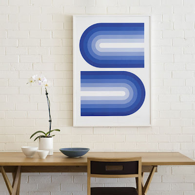
 The creative team at Cul-de-sac is releasing its first range of limited edition prints. Blending the hallmarks of Danish design, Italian style and Pop Art punch, these three geometric prints are timeless artworks that will add visual impact to any interior. These are the first in what will be an on-going series of prints playing with the team’s theme of the cul-de-sac… a street that is open at one end only, a journey that brings you home.  The first series, seen displayed in the studio of iconic designer Khai Liew, features a punchy orange design; another with geometric curves of tonal blue and a third print of a smaller repeating pattern in yellow.  Each print is released in a limited edition of 20 prints.


visit the site : 2modern

The Transformation of a Post-War House Into a Fantastic Residence

Tuesday, May 24, 2011


 The Roberts Residence is one of those homes that received a total makeover, making it hard to recognise after the architects finished working on it. The post-war house that used to occupy the lot has been transformed into a freshly designed residence for a young family of four. All the spaces in the house – the master bedroom and bath, 2 additional bedrooms with a bathroom and playroom for the children, the kitchen, living room, an office, gym, laundry room and storage – were recreated by tearing down the interior walls, second floor and roof. The 3,500 square feet house became a dream home situated on a slightly sloped terrain. A double-height volume featuring a glazed wall opens up to the outside space, offering beautiful views of the nearby park.

 The kitchen was prolonged outside on the terrace, creating a natural gathering space for the family and guests. Division1 Architects worked on this project that surprises the most elemental human desires: a dream home surrounded by nature. Thanks to Debi Fox Photography, we can all enjoy the beautiful Roberts Residence. Look below to see the before and after pictures.


visit the site : freshome

kew cylindrical pouf by missoni home

Monday, May 23, 2011

               
                                      just price : kew cylindrical pouf by missoni home

modern architecture from around the world


by kredblue


by ollyester


Curious building by Olli Wilkman


The Cielito Querido Café by Hector Esrawe & Ignacio Cadena

Sunday, May 22, 2011


I recently found this great Cafe on design work life blog and thought you would all like it. The Cielito Querido Cafe has been designed by Esrawe in col­lab­o­ra­tion with Ignacio Cadena, with inspiration from popular mexican music. Every aspect of this interior has been well thought out from the typography and packaging through to the choice of colour, and layout. To see more work by Esrawe check our this website or visit Cielito Querido Cafe on Facebook


visit the site : featureme

Alphabet Building by MVRDV

Saturday, May 21, 2011


Dutch architects MVRDV have designed this creative industries office block in Amsterdam that has letters of the alphabet cut out of the facade.

visist the site : dezeen

angelo:HOME Sutton Loveseat with 2 Pillows, Golden Honey

Thursday, May 19, 2011


                 just price : angelo:HOME Sutton Loveseat with 2 Pillows, Golden Honey

FLOWING LAKE RESIDENCE

Wednesday, May 18, 2011


 Everything about this home brings up a random, undefined wave of nostalgia. Growing up I was never around homes like this, but the surrounding woods look all too familiar. If I was to pick my favorite part about this house I would have to say it would be the use of the dark vertical siding for its color palette. The palette is a really natural reflection of the surrounding trees.Everything about this home brings up a random, undefined wave of nostalgia.

 Growing up I was never around homes like this, but the surrounding woods look all too familiar. If I was to pick my favorite part about this house I would have to say it would be the use of the dark vertical siding for its color palette. The palette is a really natural reflection of the surrounding trees.


visit the site : contemporist

Spanish Dining Room

Tuesday, May 17, 2011

Luxury Spanish Dining Room
Spanish Dining Room Ethnic
Elegant Spanish Dining Room
White Spanish Dining Room
Outstanding Spanish Dining Room Design
Old Spanish Dining Room
Woods Spanish Dining Room
Spanish Dining Room with Brown Theme